 Sometimes the best shoots are the ones where you just have to make do. A recent music video threw me a challenge: do the best you can with two lights. So… I did. Here’s how…
Recently Sony sent Adam Wilt and I an F55 with beta firmware, which they asked that we test. The best way I’ve found to test a camera is to take it out and use it, so I contacted director David Fine and asked if he had anything cooking in the spec spot or music video department. Turned out he did, and within a week we spent a long day shooting a project for the band Wampire.
The beta firmware specifically enabled high speed shooting in the F55, allowing us to capture up to 120fps internally and 240fps to raw. I’ll get into details about that experience in a later article. In this one I want to talk about how I lit a specific interior scene with very few lights.
We had three interior locations that day, and one of them was a very old-looking library in a large dot-com company’s San Francisco headquarters. I always have gut feelings when walking into a new location, and a certain amount of the time it’s a sinking feeling caused by white walls, the DP’s greatest enemy. In this case the library walls were a rich chocolate color with lots of texture in the form of shelves and books, and I sighed with relief. I love lighting but hate unlighting, and that’s what I end up doing most in a light-colored room: cutting light off of walls and adding negative fill to create a contrasty and interesting image. Contrast makes things pop off the screen, and my goal is to create as much contrast between scenic elements as possible. Shooting against a dark background makes that easy as I can focus on lighting foreground well instead of compromising to keep the background dark.
The only downside to a really dark location is that there’s no ambient fill light at all. If you don’t specifically add ambience it just isn’t there.
First, here’s the music video. The sequence I’m talking about starts immediately after the drumming scene:
We were already about ten hours into our “day” when we started lighting this scene so I wanted to keep things simple, but it still took me a couple of tries to get the lighting right. We had three lights total, along with a couple of light stands, maybe two C-stands, a couple of flex fills and a 6’x6′ piece of grid cloth. As a rule I hate shiny flex fills: they aren’t rigid enough to hold their shape so their hot spots drift around like rippling water or soft searchlights. Matte-finish flex fills are reasonably useful. And they were free, which always helps on a freebie experimental project.
The story is about a couple that’s fallen into an abusive relationship, and I wanted to reflect that in the lighting. She had to look great; him, not so much. Initially I tried creating a soft source on the floor between them but they both looked a bit too bottom lit. I tried again with our one soft box but got unpleasant results as well. Bounced light off the floor looks great if the source is big enough, but a 4’ square of bounce light on the floor between our two talent worked great on him but not so much on her. If I’d had additional lights and crew I could have cleaned that up and made it work but the lighting/grip crew consisted of myself and a gaffer so I held myself back to a two-light limit.
Having resolved to get the light out in front of our actors I hung the 6×6 grid on a wall in the corner of the library opposite both the camera and the actress to give her a nice big soft beautiful key light. We used a black skinny flex fill as a flag and cut some light off the bookshelves, as the very bright shelves just to the right of the bounce source gave away the fact that there was a light just outside the left edge of frame.
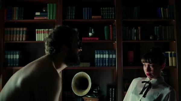
I love soft sources. They do such subtle and beautiful things. They don’t just cast light into a set, they reflect in shiny surfaces — and as there are very few surfaces in the world that aren’t shiny, they tend to bring an awful lot of things to life with a little bit of sparkle. Lighting a slightly shiny surface with a large soft source results in a beautiful glow in flat surfaces and nice clean lines along curved surfaces. Soft light makes nearly everything come to life.
The only downside to soft light is that controlling contrast can be difficult, as soft light tends to go everywhere and ambient fill is generated when that light reflects off every surface it strikes. In a dark room, however, this isn’t a problem.
Look at how beautiful the shelves are. There’s so much subtlety to how the light falls across the books, and the shadows they cast are soft and complex. The shiny corners of the bookshelves and books reflect a little extra light as they act like miniature mirrors and reflect the large light source toward camera, bringing all those little edges to life. The phonograph horn is especially beautiful and rich, simply because the amount of light it catches and reflects changes subtly with the curves of the metal.
It’s tough to get one light to light both the foreground and the background well at once, but in this room one large soft source did the trick. The highlights in the objects on the shelves, as well as on the shelves themselves, caught the light beautifully against the dark and shadowy background.
Lighting the male talent was a little tougher. I didn’t have another large piece of fabric to use as a return source, and I didn’t want to make him look that pretty, either. A white flex fill placed against the lower shelves, to the right and behind the actress, did the trick when lit with a small fresnel. (The 6’x6’ was lit with a 1k open face unit, while the flex fill was lit with a 650w fresnel. Both were tungsten.) The smaller source resulted in harder shadows that sketched him out of the darkness.
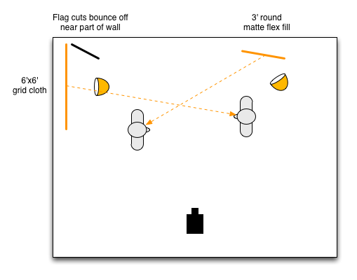
(We pulled the guy forward toward camera to prevent him from blocking the girl’s light in such a small space.)
Even though I swore I was going light this scene with two lights, I did add a third at one point just to see if a bit of fill helped. It really didn’t. The room suddenly felt artificially lit, as if I’d hung a fluorescent light overhead. For what we were doing I felt much better just letting all the shadows go black.
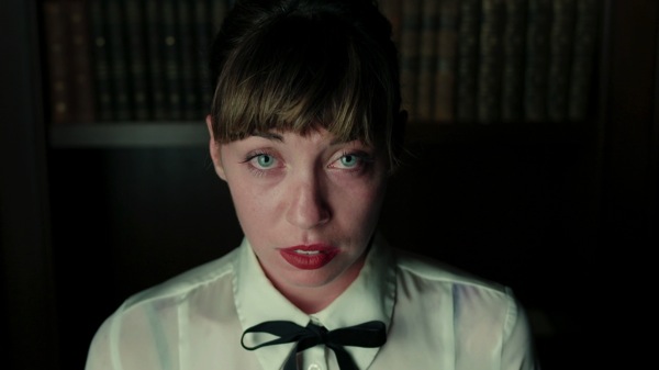
For this closeup I used the 6’x6’ grid cloth stretched between two stands just outside frame left. I lit it with one light, probably the 1k open face as open face lights pack a lot more punch than fresnels do. (The light from fresnels is prettier as the lens causes them to cast an even beam of light with very sharp shadows, but open face lights and pars are great for brute force bounces or pushing through thick diffusion.)
I know a lot of DPs and gaffers who like to back large sources away from the talent, and I get why that can be useful: if the source is too close then the actor’s exposure is going to change dramatically if they move too far toward it or away from it. If I know the actor isn’t going to shift position much I like to get it as close as possible as I get much softer highlight-to-shadow transitions, plus I get more contrast in the wrap around the face. If the source is close to the side of the actor’s face then that area will get more light, while the far edge that extends toward the camera contributes less light to the front of the face. This exaggerates the effect of the light as it wraps around the face as the side of the face is brighter than the front, and then the light softly trails off into shadow on the fill side.
This isn’t super obvious here, but here’s what’s happening:
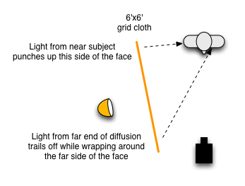
The other nice thing about having a big source so close to a face is that skin is shiny and reflects that big soft source in any curve that faces the source, such as cheek bones. (In this case it’s reflecting a lot in the camera left side of her nose, which could have been cleaned up a bit with power if we’d had any.)
There’s a beautiful catch light in her eyes. Big sources don’t always make for the best eye lights as they don’t show up in eyes with as much contrast as bright, pin point light sources do, but it’s still a very interesting look.
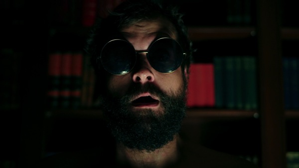
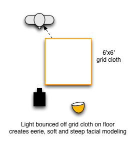
Lighting the guy was easy: I laid the 6’x6’ grid cloth on the ground and smacked it with a light. That very soft light raking his face at a very steep angle created exactly the look I wanted: ominous but still naturalistic. This is exactly the same kind of look you’d get if he was standing over a table lamp or some other soft source. My goal is always to use light to create a mood without calling attention to the fact that I’ve done so. My tastes dictate that my lighting effects should feel like something that could actually happen in the real world.
There was no need to use a back light in either of these shots as there’s a fair bit of separation between the actors and the background, especially on the fill side where the dark facial shadows stand out nicely against lit books.
In my next article I’ll talk about the drumming scene and the bar scene, so stay tuned…
About the Author

Director of photography Art Adams knew he wanted to look through cameras for a living at the age of 12. After spending his teenage years shooting short films on 8mm film he ventured to Los Angeles where he earned a degree in film production and then worked on feature films, TV series, commercials and music videos as a camera assistant, operator, and DP.
Art now lives in his native San Francisco Bay Area where he shoots commercials, visual effects, virals, web banners, mobile, interactive and special venue projects. He is a regular consultant to, and trainer for, DSC Labs, and has periodically consulted for Sony, Arri, Element Labs, PRG, Aastro and Cineo Lighting. His writing has appeared in HD Video Pro, American Cinematographer, Australian Cinematographer, Camera Operator Magazine and ProVideo Coalition. He is a current member of SMPTE and the International Cinematographers Guild, and a past active member of the SOC.
Art Adams
Director of Photography
www.artadamsdp.com
Twitter: @artadams
